This is one of my biggest pet peeves and something I still encounter it frequently. The problem can be defined as labelling link text inappropriately. The best worst example of this is the phrase "click here,” as in "to read our 2017 annual report, click here” where are the words "click here" are a link to the report.
I have written about the click here problem before. It's a remnant from back when the Internet was new and people didn't know how to interact with links, so we had to actually explain what to do with them. Unfortunately, this led to all kinds of usability challenges, one of the most problematic being that search engines can't understand what's behind a click here link, and therefore wouldn't be able to index that page accurately.
But bad link text extends beyond click here. Any reference to the mechanics of interacting with the webpage or the location of elements on the page is problematic. Content authors often write things like, "sign up for our newsletter in the right-hand sidebar.” Are you sure your signup form is always on the right-hand side? What if I'm using a smartphone? What if I'm blind?
The best way to label link text is to follow these guidelines from the W3C:
When calling the user to action, use brief but meaningful link text that:
- provides some information when read out of context
- explains what the link offers
- doesn’t talk about mechanics
- is not a verb phrase
For more on the click here problem, see my other article about why you shouldn't say "click here".

Carousels (or sliders, or rotating image galleries) are the rotating images that appear at the top of a homepage promoting the latest and greatest site content. When they first appeared, carousels provided a way for different nonprofit stakeholders to all have their content showcased right there on the homepage. Carousels make everyone happy… Everyone except your visitors, that is.
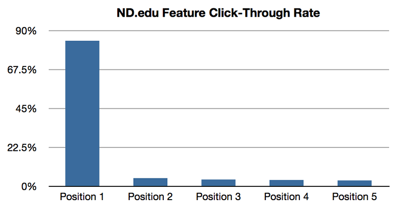
There have been myriad studies done on the effectiveness of carousels as a marketing tool, and what they've determined is that carousels don't work. One study concluded that 1% of visitors actually clicked a slide in a carousel. Of those clicks, 89% were the first slide.
Another problem with carousels is that they are nearly impossible to build with accessibility in mind. They're very difficult to use on smartphones and on assistive devices used by disable visitors.
The truth is, many nonprofits overestimate the importance of their homepage, so whatever appears at the top of your homepage, having it there is probably not as lucrative as you think.
If you still like the idea of an attention-grabbing image, instead of the carousel, try one hero image. Along with improved usability, an added benefit to a hero image is that it forces your organization to make decisions about what content is most important to promote there, rather than stuffing everything under consideration into one spot.
(Pro tip: If your CEO asks where the carousel went, tell him it's still there, but now it only has one slide!)
When The Web was young, splash pages were everywhere. When you visited the website, you would see what is effectively an ad for the website itself before you entered the website. The splash page usually consisted of the nonprofit's name along with an image and possibly a mission statement, and then an Enter button. Fortunately I don't see that too often these days.
What I do sometimes encounter even now are decision prompts presented in the form of splash pages. These can be language-selection prompts for multilingual sites; or “front door” pages that ask you to choose the public site or the members site.
If I've already typed in your website address, you can reasonably assume that I want to visit your website, so don't get in my way by forcing me to make a decision before I even get there. Imagine approaching a clothing store and being stopped by an employee outside the front door and asked “Are you looking for menswear or ladieswear?” Sure it might be helpful, but it's offputting to be required to make such a decision at that point in the experience. And we’re all able to locate the correct department just fine once we we're inside.
Your website should function in much the same way: If there are decisions that your visitor needs to make with regard to interacting with your website, make those options clear on the inside of the site, and until the visitor makes a decision, default to the option that's relevant to most of your audience and your business objectives. If your public site is the one that most people tend to visit, send them there first, with a link to the members site clearly visible. If most of your audience speaks English, default to the English site, and include a clearly visible link to the French site.
And don't forget that you can always create section-specific URLs that send the visitor directly to one area or another so they don’t have to make the decision. For example when I'm promoting this post, I will link to belikewater.ca/blog/entry/ux-problems-part-1 rather than just belikewater.ca.
You can also set a cookie that remembers the visitor's selections when someone uses your site, so that you can deliver the same options automatically the next time she visits.
So there you have my first few tips for improving your nonprofit website's user experience design. This is the end of Part One, but come back next week for more UX tips in Part Two!
Have I made you consider a viewpoint you hadn't before? Or do you and I think alike? Either way, maybe we should work together?