
Effective, custom web design and development for nonprofits.
Effective, custom web design and development for nonprofits.
Is your website riddled with the phrase “click here”? I’m amazed at how often I still see this phrase used as a link label. Using “click here” to identify links is a very bad idea and I’ll tell you why, but first, some history…
The phrase “click here” is a throwback to the late 1990s when the Web was new and many people really didn’t understand how to use it. They actually had to be told to point their mouse at a link and click on it, otherwise they might not know that there was more content available. But it’s no longer the 1990s - Your visitors know what a link is and how to use it, so it’s time to start promoting your great content and stop patronizing your visitors.
There are all kinds of reasons why you shouldn’t use “click here.” For one, not everyone clicks. People use many devices to browse the Web these days: PDAs, phones, screen readers…not just standard computers. People are tapping, touching, typing…not just clicking.
Search engines also get confused by the phrase. Search engine bots rely on a link’s label to identify that link’s content and match it with people’s search terms.
And of course the phrase “click here” just doesn’t look very good. If it’s not immediately evident to you how silly the phrase “click here” looks, consider this:
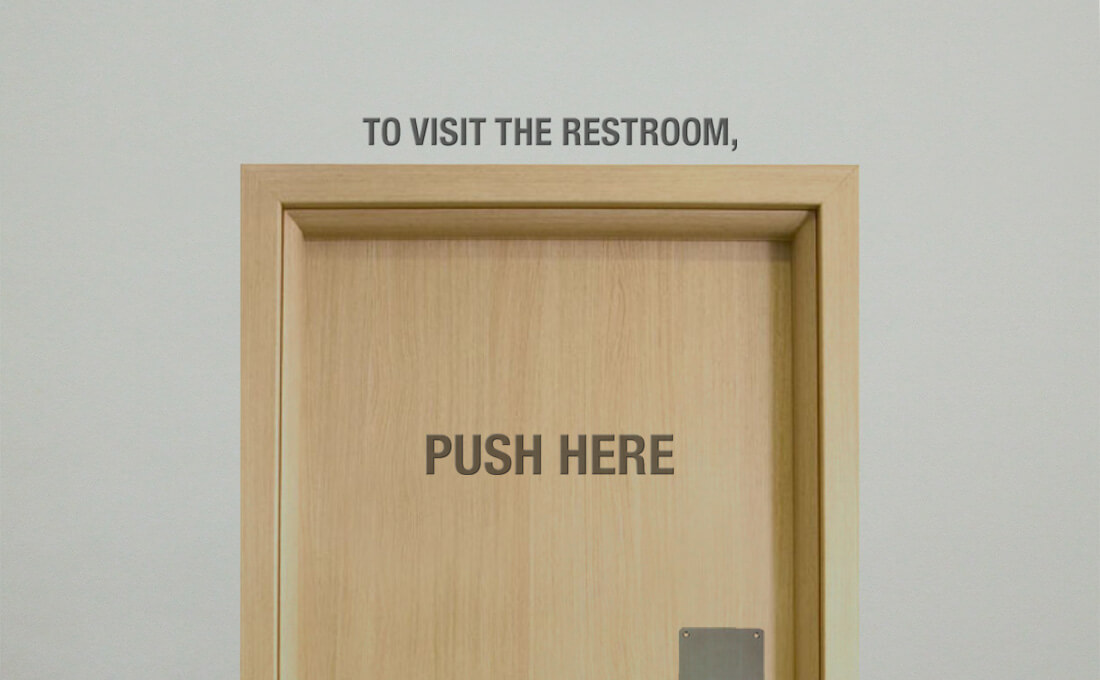
Imagine you’re in a restaurant. You get up to go to the restroom. When you find it, you see a door with a sign that reads “To visit the restroom, push here.” Ridiculous, right? You’re thinking “Don’t tell me how to interact with the door. I know how to do that. Just tell me what’s behind the door and I’ll figure out how to get there.”
The same logic should be applied when labelling links: It’s not your responsibility to explain to your visitors how to interact with links. All you need to do is make sure they can tell what the link is.
The W3C - the people who decide what constitutes standard practices on the Web - have been advising against saying “click here” for years. The W3C’s recommendations on how to phrase link text boil down to four rules of thumb:
When calling the user to action, use brief but meaningful link text that:
- provides some information when read out of context
- explains what the link offers
- doesn’t talk about mechanics
- is not a verb phrase
I find that the simplest way to test whether you’ve labelled your link properly is to ask yourself “If this link were the only phrase on the whole screen, would I still know what the link is about just by reading it?” If the answer is no, reword it. You can see how “click here” fails this test: Your content is probably not about the subject of clicking here, so links to it should not be labelled like that. So instead of this:
To learn more about Be like water, click here.
Say something like this:
Learn more about Be like water.
Considering what I said about search engines above, which of those two links do you think would fare better in results for the search term “Be like water”?
If you’re concerned that your links won’t be identifiable as such, then you need to revisit the formatting of your website copy. Your website copy should essentially be presented in one style, and your links in another (usually underlined and/or a different colour) making them identifiable simply because they look different.
If you’re worried that yours won’t, then you’ve probably tried to make certain blocks of text stand out by peppering your website copy with all kinds of different formatting: bold text, underlines, multi-coloured words, various letter sizes, fonts, and so on. This is another bad idea. When is the last time you read a book that had various formatting styles within a paragraph?
Your body copy should be legible, first and foremost. Sure, you can emphasize certain parts of your content with the odd bold or italicized phrase, but the best way to ensure that your readers notice the important parts of your content is to hire a great copywriter to present your content accordingly.
Your audience is visiting your website to learn about your organization, not to learn about how the Web works. Present your content with that in mind.
Be sure to check out the "click here" episode of the Website 101 Podcast that I recorded with Sean Smith.
Have I made you consider a viewpoint you hadn't before? Or do you and I think alike? Either way, maybe we should work together?