The Canadian Paediatric Society

The Canadian Paediatric Society

Challenge

I was honoured to be invited to work with the Canadian Paediatric Society once again, this time to redesign their main website, CPS.ca. The CPS hired me to create a visual concept for the homepage of CPS.ca. Once complete, I assisted their internal Web developer with extrapolating elements of that design and incorporating them to the rest of the site.

Solution

For CPS.ca, the focus was on creating a strong first impression and enhancing usability through design. I developed a new homepage concept that balanced the organization's clinical authority with its commitment to child and family health. The design emphasized simplicity, clean typography, and a clear visual hierarchy to guide users to key information quickly. Once the homepage was approved, I supported the CPS’s in-house developer by providing design guidance and assets that could be adapted across the full site, ensuring visual consistency without adding complexity to their build process.

Results

The redesign of cps.ca gave the Canadian Paediatric Society a cleaner, more modern web presence that better reflected the organization’s authority and professionalism. The new design improved readability, streamlined navigation for healthcare professionals and parents, and made key resources easier to access. Stakeholders and visitors submitted rave reviews to the refreshed look and feel, which also laid a strong foundation for the development team to implement the design efficiently and maintain consistency across the site.

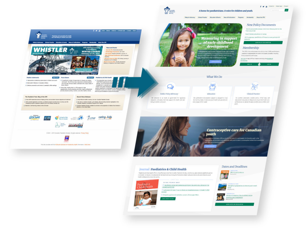
The previous design of cps.ca (left) and my new one (right).

As usual, Mike brought his keen sense of design and understanding of our target audience...I look forward to working with Mike again, and would highly recommend him. 

- Elizabeth Moreau,
CPS

User Experience

To start off, I brought in my colleague Sean Walsh to perform a User Experience (UX) audit on the previous version of cps.ca and determine where improvements could be made to the design from a usability standpoint. Sean identified several opportunities for improvement that resonated with the CPS, including:

  • Replacing the French/English language selection splash page with a simple language switcher link in the header;
  • Increasing the size of the logo on mobile divices to provide a visual anchor for visitors;
  • Replacing the slide carousel with one mobile-friendly hero image;
  • Adding a high-visibility call-to-action to increase memberships, including a description of the benefits of membership;
  • Reducing the amount of copy on the Three Pillar boxes.
Cps style tiles
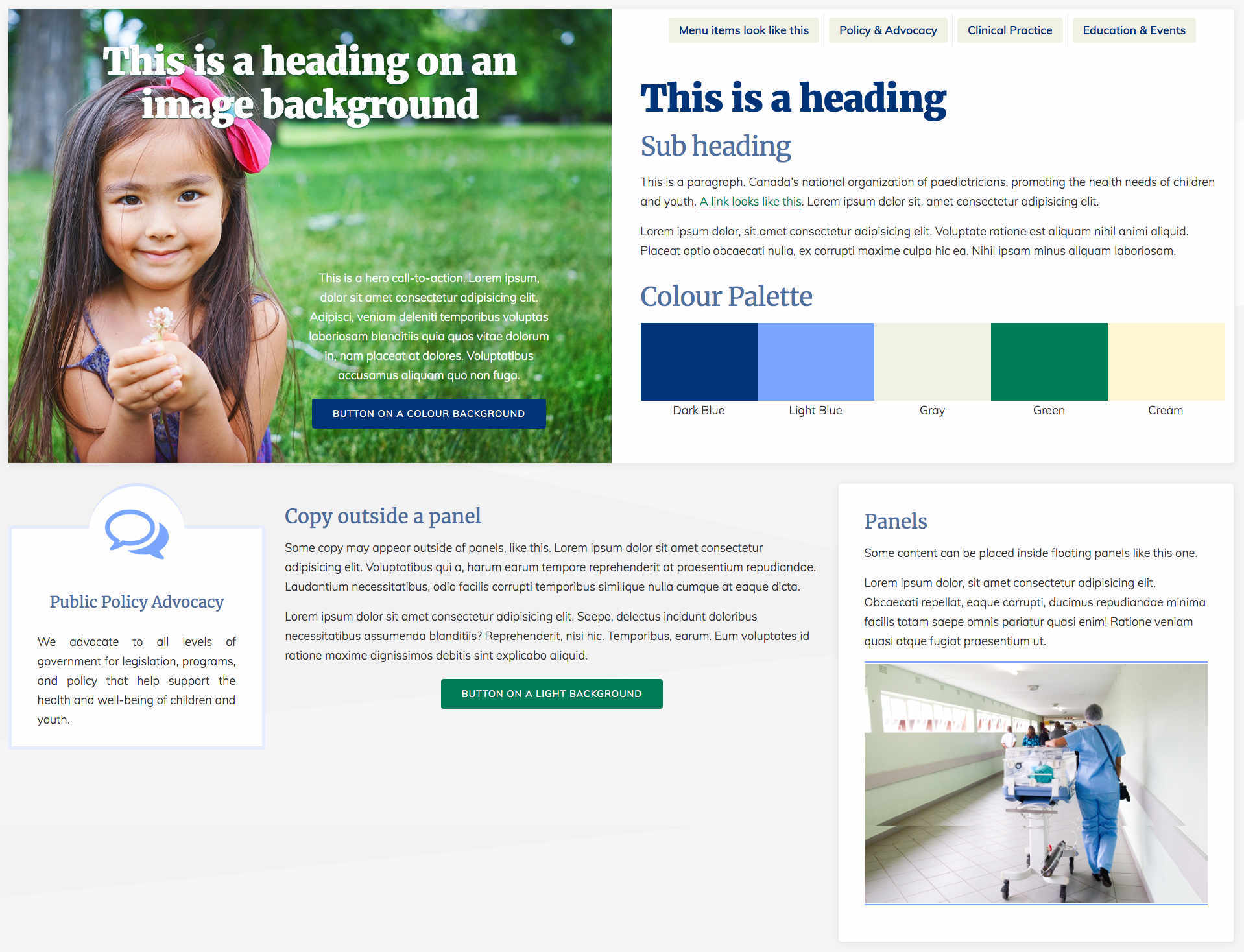
Style tiles illustrate a site's visual identity without any consideration for layout or content.

Visual Design

I started my design by developing a colour palette based on the navy blue colour in the CPS logo, which would not be changing.

Once we decided on a colour palette, I developed a set of style tiles. Style tiles are a collection of colours, fonts, and other elements that illustrate the visual identity that will eventually make up the webpage. These elements are placed together on the page fairly randomly and without any consideration for layout or content. This is a great way to allow the client to get a feel for the design at a glance, without getting distracted by content organization and messaging.

Engaging, but readable

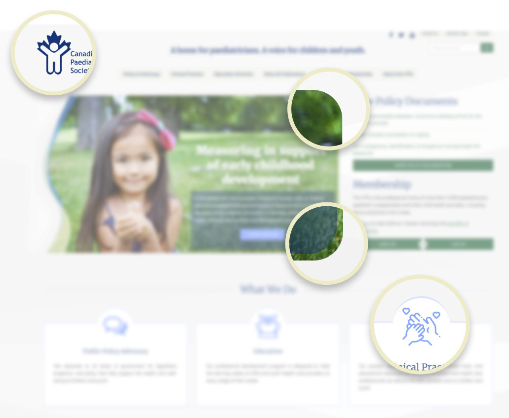
As I did for another project—Caring for Kids New to Canada—I incorporated aspects of the CPS logo into the design as a “flourish” element. The top-right and bottom-right corners of the hero image have a wide curve, reminiscent of the head, hands, and feet of the human figure in the logo.

As you scroll down the page, this is implied again on the "Three Pillar" components under What We Do: each component contains an icon to represent that pillar. Those icons are vertically offset such that they overlap the top edge of the box, surrounded by a rounded border the same size as the corners of the hero image.

All this is meant to make the design more cohesive and recognizable as the CPS, but without being too explicit about it.

Preview from the website The Canadian Paediatric Society
Members can log in directly from the homepage.

Subtle Animations

Presenting important clinical information for medical professionals is always challenging, because the content needs to remain readable at length while still being presented in an engaging design. To help accomplish this, I added some subtle animation effects into the page. The navigation menu on smaller mobile devices collapses into an expandable accordion menu. The Three Pillar elements that show the main focuses of the CPS have a graceful floating focus effect when you mouse over them on a desktop.

I also wanted to simplify the login process to be more user-friendly: Clicking on the Log In button triggers an animated dropdown box containing the login fields, rather than sending the user to a new login page.

Cps hero
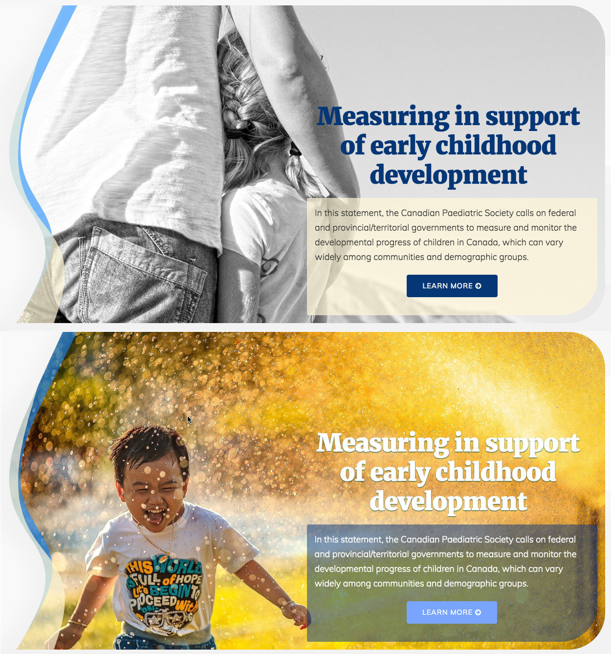
Content managers can control the colour of text on the hero image with the tick of a box. Dark (top) or light (bottom).

Good design helps visitors and website owners

Good Web design is not only about providing an optimal experience for visitors, but also for administrators of the website. The team at the CPS need to manage content daily, so I wanted to make that experience as painless as possible.

Sometimes staff may choose a hero image with a light-coloured background. In this case, the heading overlaid on top of it needs to be dark enough to provide readable contrast against the image. But other hero images may call for a more light-coloured heading to maintain that readability.

To make this easy for them to maintain, I built a “smart” hero image: When uploading a hero image into the content management system, content managers can also indicate whether its heading, buttons, and copy should be light or dark coloured by ticking a checkbox, and the code does the rest.

User Feedback

The following are some comments about the CPS redesign submitted post-launch:

You all deserve praise! The interface is warmer, more aerated, clearer, and I love the color scheme and the fonts used…VERY user-friendly!

The new CPS website looks FANTASTIC! Thank you to the creators of this new, brilliant interface!

Looks great. Really like the way it's laid out and how to access the 3 major things that the CPS does. Awesome job. Kudos to the communications team and the web designer.

Post-Project

Client Feedback

Updating the design on our flagship website—www.cps.ca—was not an easy task, given some of the parameters, but as usual Mike brought his keen sense of design and understanding of our target audience. Mike integrated current features and functionality, so our website feels current without being too "trendy". I look forward to working with Mike again, and would highly recommend him.

- Elizabeth Moreau, Director, Communications & Knowledge Translation,
Canadian Paediatric Society

Like what I did with
The Canadian Paediatric Society?

Get in touch and let's talk about what I can do for you.

Reach me

Have a question or want to discuss a project? Let's talk.

Be Like Water on LinkedIn.

Stay current

Quench your web dev thirst with Droplets : Easily absorbed tips for nonprofits. Sent to your inbox periodically from Be Like Water.

what do you mean

Be Like Water?

"Whatever is fluid, soft, and yielding will overcome whatever is rigid and hard. The best way to live is to be like water."
- Lao Tzu

Copyright © 2025 Be Like Water Media, Inc.