
Effective, custom web design and development for nonprofits.
Effective, custom web design and development for nonprofits.
We absolutely made the right choice when we decided to develop our new site with Mike and BLW. From early sketches to launch and through to maintenance, Mike has been collaborative, guiding in his vision while still open and responsive to our feedback. In addition to being a skilled designer, Mike is a polished project manager and a great communicator. He heard our unique needs and challenges and ensured that the site that was designed was the one that the Monitor needed. I've worked on several website redesign projects and none of them have been as smooth and successful as this one.
Róisín West, Senior Editor of the Monitor and Behind the Numbers, Canadian Centre for Policy Alternatives
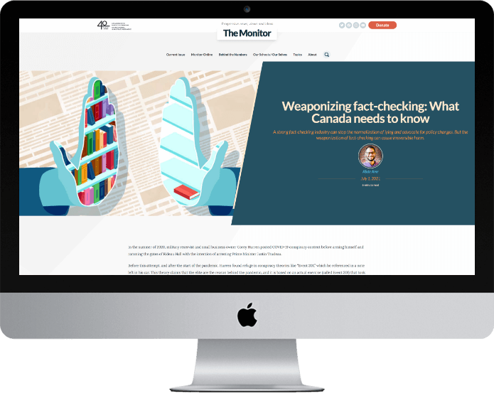
The Monitor is a site I built for the Canadian Centre for Policy Alternatives. It won gold for "Best Digital Edition Publication, 2021" from the Canadian Online Publishing Awards.
The site features an advanced search function that lets visitors find articles based on keyword, author, and date range. It has an alphabetized directory of authors, a client-managed archive of past issues, and a robust caching feature so that pages load lightning-fast.
Check it out at monitormag.ca.
Like what I did with The Monitor? Get in touch and let's talk about what I can do for you.
Although we were pleased with the popularity of the Caring for Kids’ website content, the previous static design no longer met our needs. Mike seamlessly brought our vision to life, and offered creative and dynamic design and navigation solutions, including an attractive mobile-responsive design. He also created a new colourful wordmark that better represents our audience and content. Mike is a dream to work with – his expertise comes through in his thoughtful suggestions, and he always has the client’s best interest at heart.
Francine Charbonneau, Manager of Public Affairs, Canadian Paediatric Society
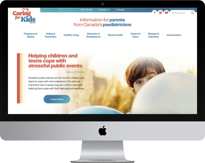
Caring for Kids provides information for parents from Canada's paediatricians. I redesigned the site, developing a new colour palette as well as a fresh new wordmark, translated into both English and French. See the site at caringforkids.cps.ca
Like what I did with Caring for Kids? Get in touch and let's talk about what I can do for you.
Updating the design on our flagship website—www.cps.ca—was not an easy task, given some of the parameters, but as usual Mike brought his keen sense of design and understanding of our target audience. Mike integrated current features and functionality, so our website feels current without being too "trendy". I look forward to working with Mike again, and would highly recommend him.
Elizabeth Moreau, Director, Communications & Knowledge Translation, Canadian Paediatric Society
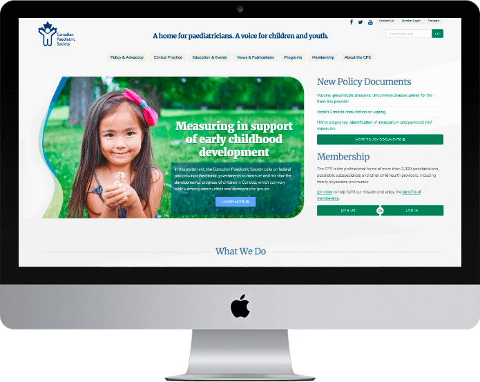
I was honoured to be invited to work with the Canadian Paediatric Society once again, this time to redesign their main website, CPS.ca. The CPS hired me to create a visual concept for the homepage of CPS.ca. Once complete, I assisted their internal Web developer Rob Hallatt with extrapolating elements of that design and incorporating them to the rest of the site.
The main objective for this redesign was to give the organization a fresh new look on the Web and to improve the usability of the site.
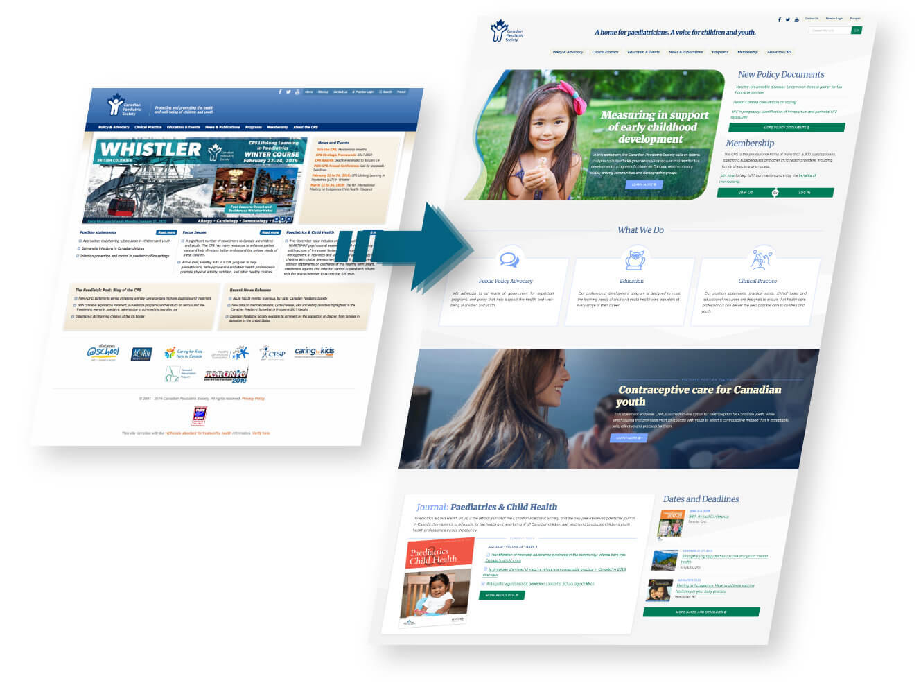
To start off, I brought in my colleague Sean Walsh to perform a User Experience (UX) audit on the previous version of cps.ca and determine where improvements could be made to the design from a usability standpoint. Sean identified several opportunities for improvement that resonated with the CPS, including:
I started my design by developing a colour palette based on the navy blue colour in the CPS logo, which would not be changing.
Once we decided on a colour palette, I developed a set of style tiles. Style tiles are a collection of colours, fonts, and other elements that illustrate the visual identity that will eventually make up the webpage. These elements are placed together on the page fairly randomly and without any consideration for layout or content. This is a great way to allow the client to get a feel for the design at a glance, without getting distracted by content organization and messaging.
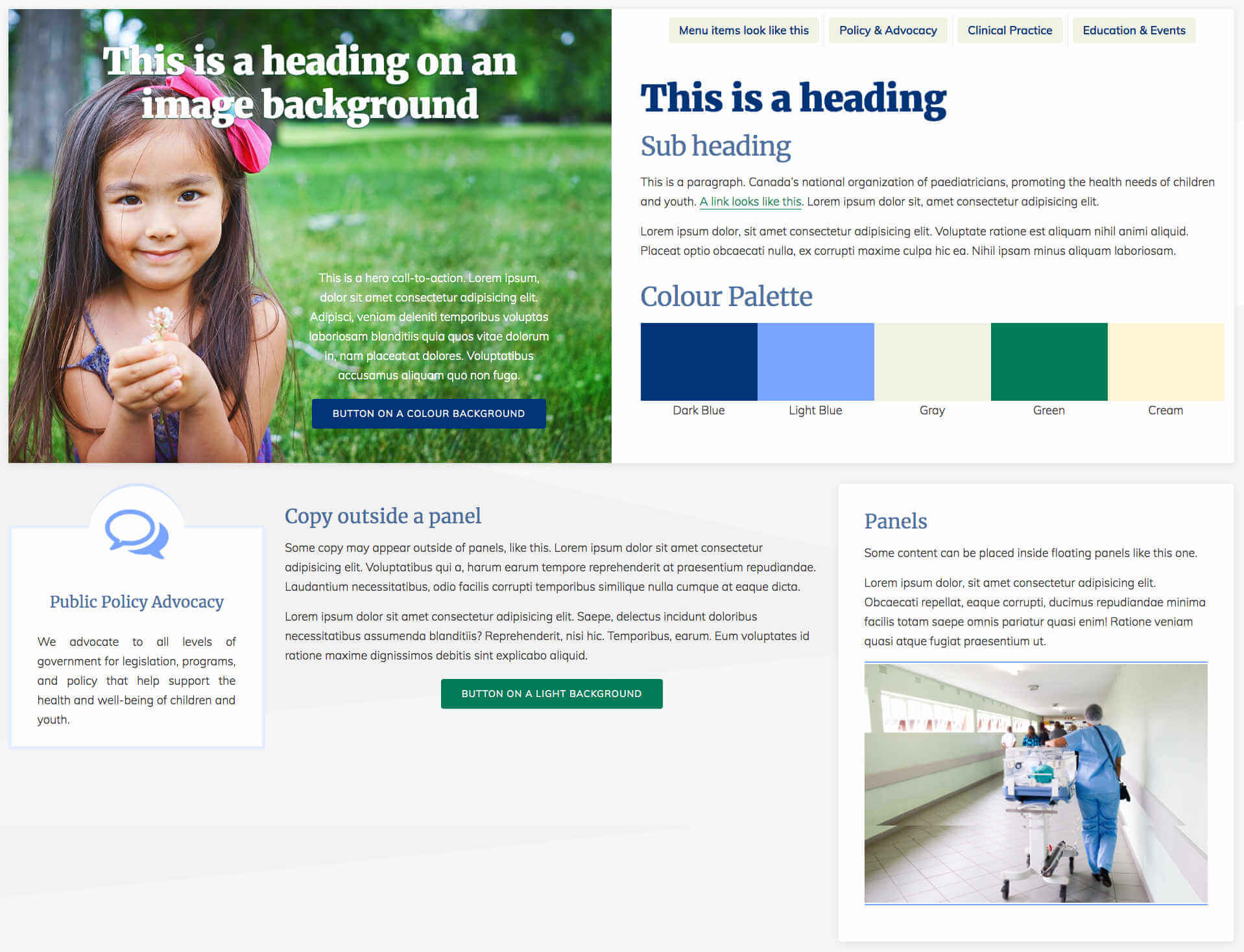
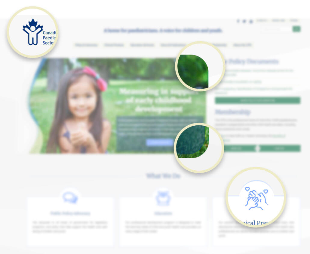
As I did for another project—Caring for Kids New to Canada—I incorporated aspects of the CPS logo into the design as a “flourish” element. The top-right and bottom-right corners of the hero image have a wide curve, reminiscent of the head, hands, and feet of the human figure in the logo.
As you scroll down the page, this is implied again on the "Three Pillar" components under What We Do: each component contains an icon to represent that pillar. Those icons are vertically offset such that they overlap the top edge of the box, surrounded by a rounded border the same size as the corners of the hero image.
All this is meant to make the design more cohesive and recognizable as the CPS, but without being too explicit about it.
Presenting important clinical information for medical professionals is always challenging, because the content needs to remain readable at length while still being presented in an engaging design. To help accomplish this, I added some subtle animation effects into the page. The navigation menu on smaller mobile devices collapses into an expandable accordion menu. The Three Pillar elements that show the main focuses of the CPS have a graceful floating focus effect when you mouse over them on a desktop.
I also wanted to simplify the login process to be more user-friendly: Clicking on the Log In button triggers an animated dropdown box containing the login fields, rather than sending the user to a new login page.
Good Web design is not only about providing an optimal experience for visitors, but also for administrators of the website. The team at the CPS need to manage content daily, so I wanted to make that experience as painless as possible.
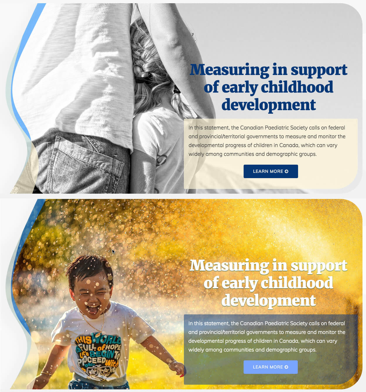
Sometimes staff may choose a hero image with a light-coloured background. In this case, the heading overlaid on top of it needs to be dark enough to provide readable contrast against the image. But other hero images may call for a more light-coloured heading to maintain that readability.
To make this easy for them to maintain, I built a “smart” hero image: When uploading a hero image into the content management system, content managers can also indicate whether its heading, buttons, and copy should be light or dark coloured by ticking a checkbox, and the code does the rest.
The following are some comments about the CPS redesign submitted post-launch:
You all deserve praise! The interface is warmer, more aerated, clearer, and I love the color scheme and the fonts used…VERY user-friendly!
The new CPS website looks FANTASTIC! Thank you to the creators of this new, brilliant interface!
Looks great. Really like the way it's laid out and how to access the 3 major things that the CPS does. Awesome job. Kudos to the communications team and the web designer.
Like what I did with The Canadian Paediatric Society? Get in touch and let's talk about what I can do for you.
Mike took our one-dimensional content and brought it to life. His clean and thoughtful design enhances the text without competing with it. What we appreciate most about Mike is his ability to understand an audience’s needs, and use the latest technology and functionality to meet those needs.
Elizabeth Moreau, Canadian Paediatric Society
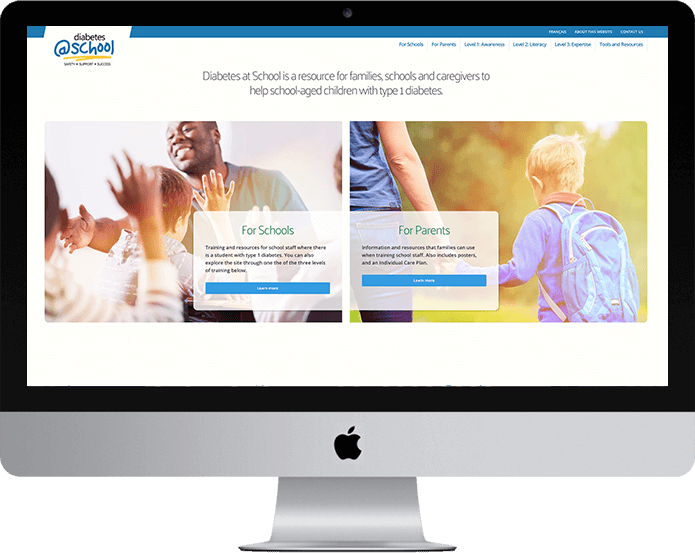
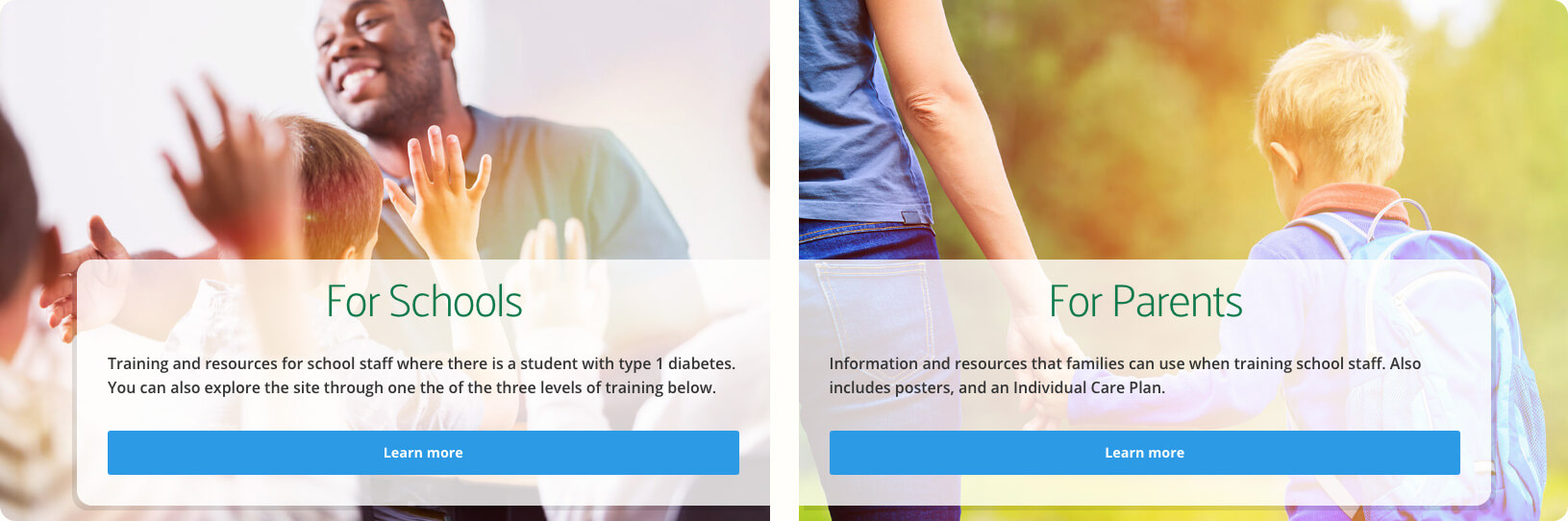
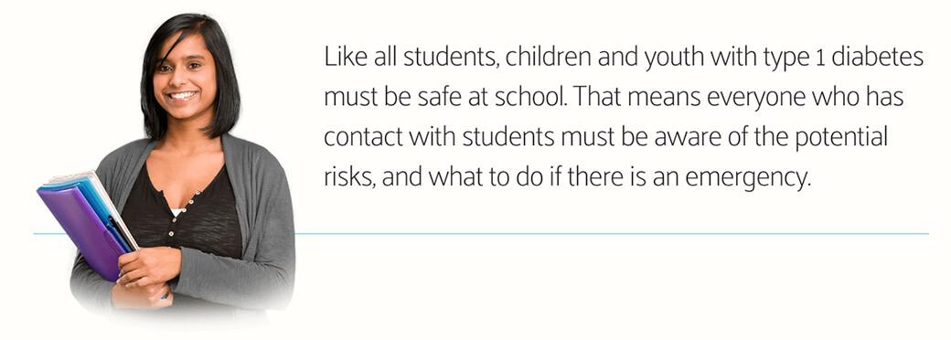
DiabetesAtSchool.ca is the second website I was hired to build for the Canadian Paediatric Society (the first being Caring for Kids New to Canada). It's a fully bilingual resource allowing families and teachers to help kids with type 1 diabetes.
The CPS had provided me with all the content for this site well in advance, as well as a logo and colour palette that their graphic designer had produced. The site was unique in that it was about kids, but for adults, so I wanted to include vibrant, positive imagery that would resonate with parents and teachers, but still portrayed a youthful feel. I also built in subtle animations throughout the design, allowing various elements to fade in gracefully to draw the eye when necessary.

For campaign websites it's especially important to maintain a unified theme throughout. For Diabetes at School, I developed several elements to achieve this.
Near the bottom of the homepage, there's an area where the CPS staff could add content that they wanted visitors to notice and access quickly. To contain this content, I designed a full-width row with a green "chalkboard" background and a photo of a student overlaid in front of it, holding chalk in her hand.
The headings in this section are displayed in a chalk-like typography, as if the student had written them on the board at school. I created this feature using an actual chalk font-face rather than an image, so that the CPS could edit the text at any time.
To help maintain continuity, I repeated the chalkboard element on all other pages as a separator above the footer. The model in the photo also appears throughout the site engaged in other student activities, such as working at a computer and carrying school books. These repeating elements help to make the site a more cohesive entity.
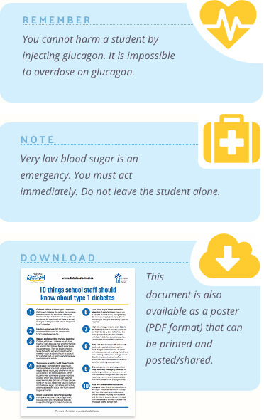
As I worked through the content, it became clear that most pages included short blurbs of text that referenced the content in various ways. Sometimes the page was available as a downloadable PDF, and that needed to be clearly identified. In other cases, there were brief reminders about diabetes that the visitor needed to be aware of.
I decided to create a sidebar to contain these elements in small modules that reflected the site's colour palette. Each module included an icon that indicated the type of content it contained. For example, a heart icon represents the "remember" module, as in: "You should know this by heart."
Like the CPS's other sites, Diabetes at School runs on the extremely flexible CMS ExpressionEngine, so I was able to code the site so that administrators could add a sidebar module on any page, and even indicate which module type it should be with the tick of a checkbox.
Diabetes at School contains a wealth of information for families and caregivers to help kids living with diabetes, so we needed a very robust navigation menu that would be easy to use on a mobile device as well as on a desktop. The menu needed to be clear and intuitive, but also encompass all the site content and reflect its architectural hierarchy in the site accurately. To accomplish this, I installed a powerful navigation menu that lets the visitor drill down into sub-pages, even on a smartphone.
I am very pleased with the results we were able to achieve in developing Diabetes at School, and the Canadian Paediatric Society continues to receive positive feedback about the site.
Like what I did with Diabetes at School? Get in touch and let's talk about what I can do for you.
Thomas Yu is one of the most well-known and respected amateur pianists in the world. He hired me to design and build his website to showcase his music and promote his live appearances. Built on Craft CMS, every aspect of the site's content can be managed by Tom himself.

The site lets Tom create blog entries as well as listings of his live appearances and relate them to each other, so that past shows are linked to articles that reference them. His videos can be easily embedded into the Music page, and the Blog section allows for images of varying sizes and positions.
Check out ThomasYu.ca.
Like what I did with Thomas Yu? Get in touch and let's talk about what I can do for you.
Mike's technical expertise, design acumen and insights for how to optimize the user experience are superb. We received an enthusiastic response from users of the site in our post-launch surveys. Mike would be the first person I'd call for another project.
Barbara Szijarto, Canadian Paediatric Society
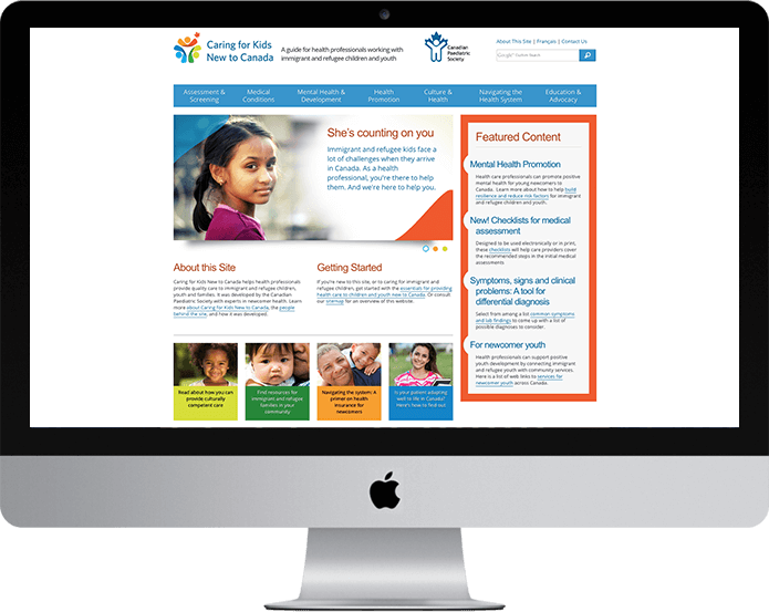
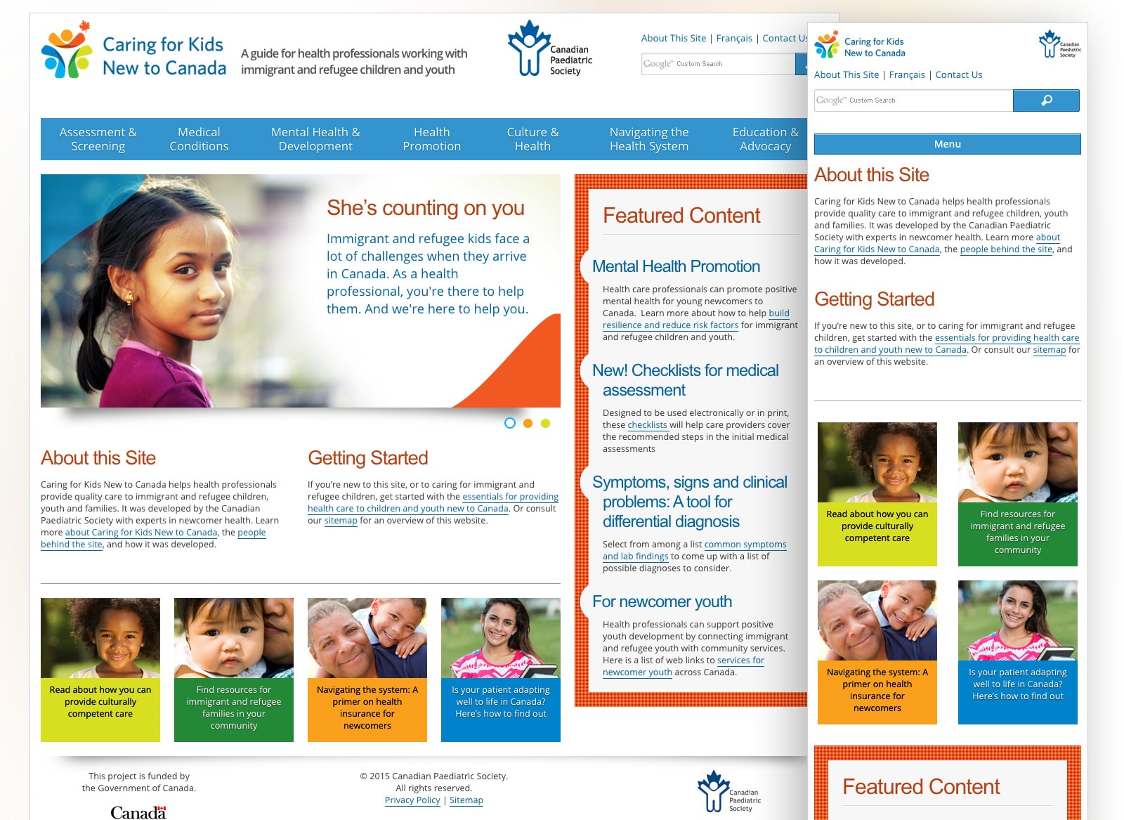
The Canadian Paediatric Society hired me to design and build the website Caring for Kids New to Canada, a site that helps health professionals provide quality care to immigrant and refugee children, youth and families. The site was a Web-version of a book that the Canadian Paediatric Society had published, and involved many editors and contributors. The site was to run on an existing install of the CMS ExpressionEngine, which powered other Canadian Paediatric Society Web properties.
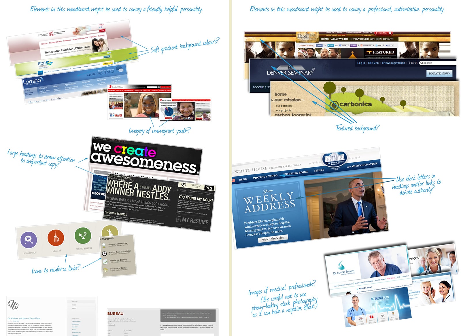
For the Caring for Kids New to Canada project, I put together some mood boards to establish a direction for the personality of the site. In the discovery phase of the project, we came up with a list of adjectives that should describe the site to visitors. The most important were friendly, helpful, professional, and authoritative. I then created a collage of screenshots of other websites from around the Web that also exhibit those characteristics, focusing on the design elements that accomplished this.
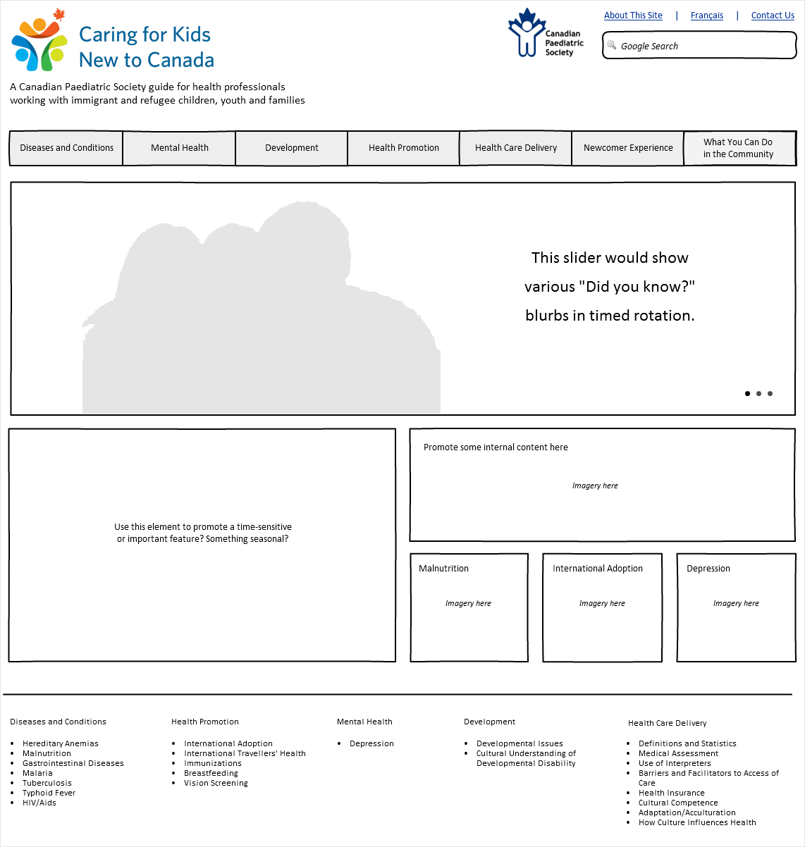
The next step in the process was to create some wireframes: simple, gray-box layouts that show where on the screen the content might go. This exercise helps everyone to focus on placement of content without being distracted by the visual design. There were several elements that needed to appear on the homepage, so I created wireframes to represent various layout options.
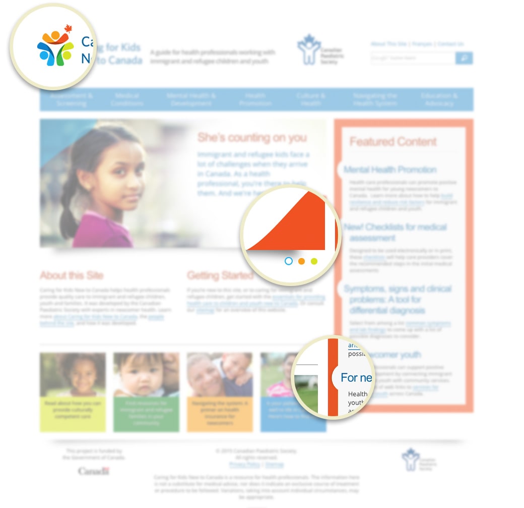
Once a personality was established for the site, we needed to create its brand identity. I subcontracted a graphic designer colleague of mine to design some logo concepts, and once we settled on one, I developed a colour palette and various design elements based on the logo.
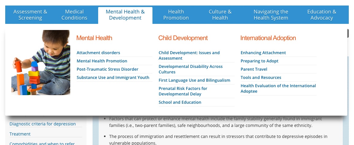
Attention to detail is very important to me, and I wanted to illustrate this on the Caring for Kids New to Canada project. To mirror the three circle "heads" in the site logo, I used three coloured ellipses as the control buttons for the sliding image carousel. I added some coloured flourishes to the corners of the carousel images as well. In the "Featured Content" sidebar, the heading of each entry is indented slightly, and I added partial circle cut-outs in the surrounding frame, again reinforcing the ellipses from the logo. The end result is a cohesive brand that is recognizable throughout the site.
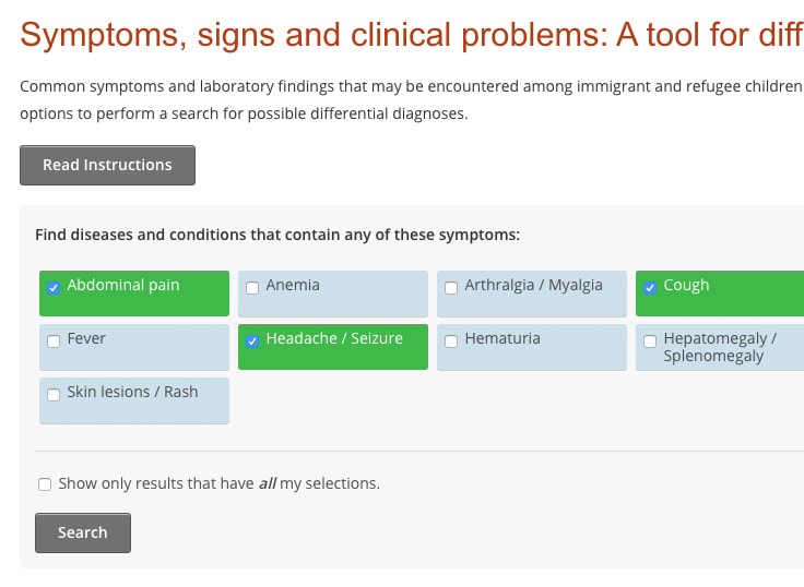
As part of the Caring or Kids New to Canada project, the Canadian Paediatric Society asked me to build a Signs and Symptoms search feature that would allow medical professionals to identify their patients' symptoms and find a list of possible diseases and conditions that match them.
Content authors can add the details about each disease into the CMS and tag them with the appropriate symptoms by assigning categories. Visitors to the site can select symptoms from the list, hit Seach, and get a list of matching diseases and conditions. The search tool allows the user to indicate whether he wants results that match all symptoms or any, and groups results by severity.
Rather than use simple checkboxes for the symptoms list, I wanted to present the visitor with large target areas to make them easy to select, especially on mobile devices. When a symptom is selected, the entire box surrounding it turns green and stays that way even after the results are shown to remind the user which ones were selected when the search was performed.
The Caring for Kids New to Canada site is content-rich, and since its target audience is medical professionals with busy schedules, pages need to be accessible quickly. To this end, I built "mega-menus" to house the navigation. Hovering over each primary navigation item causes a fly-out submenu to display showing a list of pages in that section, along with an image to help with visual recognition.
Caring for Kids New to Canada is built with responsive design and is optimized for desktops, tablets and smartphones. The site is available in English and French using a page-sensitive language selector so that when switching languages, the user sees the translated version of the current page rather than being sent back to the Home page. The domain also responds to the language preference: "KidsNewToCanada.ca" for English and "EnfantsNeoCanadiens.ca" for French.
After its launch, the Caring for Kids New to Canada website was featured on the Canadian television program CTV News.
The following are some comments about Caring for Kids New to Canada submitted by members of the target audience post-launch:
I am just writing to tell you how absolutely thrilled I am to have been forwarded your new website. You have done a beautiful job of presenting information in useable format and language. Thank you so much for putting together such an incredible resource.
I LOVE it!!! I will insist that all medical students and residents who complete electives at our clinic use this website.
Very beautiful, easy to use, inviting to use. Great links. Working really well and easy. Great job.
Excellent. Extremely clear. A great addition to the CPS tools. Very good for residents, sufficiently in depth but with additional resources available. More clear than many online tools I have used before. I will use it to teach students.
Excellent resource which I will definitely access in my day to day practice.
Like what I did with Caring for Kids New to Canada? Get in touch and let's talk about what I can do for you.