
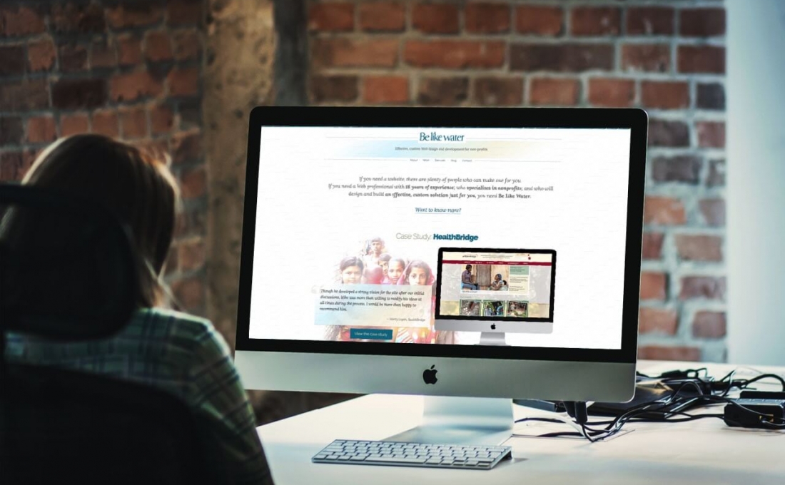
Effective, custom web design and development for nonprofits.
Effective, custom web design and development for nonprofits.
On a recent episode of the Website 101 Podcast, Sean interviews me about how I got started in web design and development.
Have I made you consider a viewpoint you hadn't before? Or do you and I think alike? Either way, maybe we should work together?
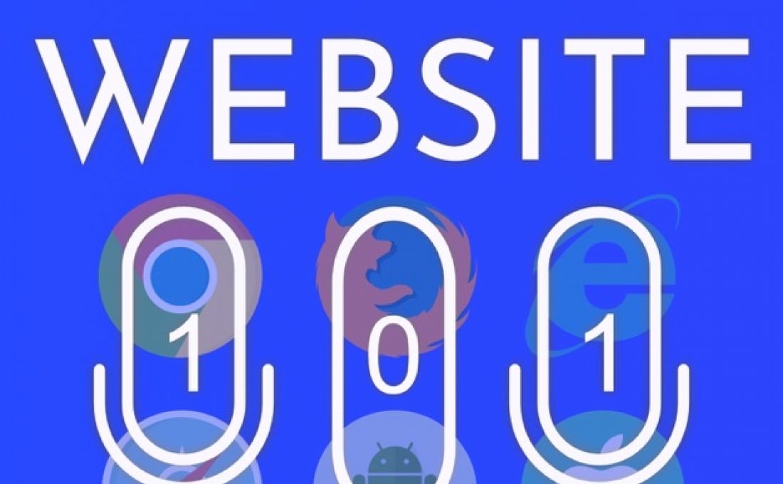
Season 4 of the Website 101 Podcast, which I co-host with Sean Smith, is on its way!
You can already hear the first episode, where Sean and I discuss a topic near and dear to me: Why you shouldn't say "click here," a subject I've written about before.
And at the end of the episode we talk about what's coming up on the podcast this season, including our interview with Amanda Lutz about "How to Talk to Your Web Developer."
Subscribe now on Apple Podcasts, Google Podcasts, or wherever you get yours.
Have I made you consider a viewpoint you hadn't before? Or do you and I think alike? Either way, maybe we should work together?
Did you know that I co-host a podcast for website owners with Sean Smith of Caffeine Creations called the Website 101 Podcast? Episode 7 of season 2 has just been released!
In this episode, we talk about the benefits of launching a website with limited features so that the project continues to move forward.
Check it out to learn about the concept of MVP, or "Minimal Viable Product."
Have I made you consider a viewpoint you hadn't before? Or do you and I think alike? Either way, maybe we should work together?


Why the gaudy animated gif, you ask? This year marks an amazing milestone for me: I started building websites 20 years ago!
As I like to say: before many of my competitors had yet discovered the Internet, I was already building websites. When I started working on the Web, Wikipedia, YouTube, and Google didn't exist yet. The iPhone wouldn't be invented until years later. Titanic won Best Picture at the Oscars.
I'm proud to say that I'm still excited to be working in Web design and development today, and I'd like to extend a special thank you to the many people I have worked with over the years. In the coming months, expect more case studies about my projects from the past year.
I hope to continue helping your organizations stay current on the Web well into the future!
Have I made you consider a viewpoint you hadn't before? Or do you and I think alike? Either way, maybe we should work together?
Searching for meaning? Start by adding meaning to your website content.
When an article from your nonprofit's website is shared on Twitter or Facebook, what does it look like? How about when your website appears in Google search results? There are two types of code that you can add to your website that will improve the way your shares and search results look, and provide more context about your content. These are called Metadata and Structured Data, respectively.
Check out these two tweets. Which do you find more engaging?:
The second one looks better because the page is enhanced with Twitter Metadata code that promotes the tweet to a "Twitter card." Similar metadata exists for Facebook and other social media platforms. Social media shares that draw the eye and provide more information about the article are more likely to get clicked than those that don't.
To check how your content looks when shared on Facebook, paste the URL of one of your pages into Facebook's Sharing Debugger. If it gives you a lot of errors, or if the preview doesn't look the way you want it to, there may be ways to improve it.
Twitter's Card Validator is a similar tool that checks how your article will look when shared on Twitter.
The second type of code you can add to your site will improve the way your pages communicate with search engines. Structured Data tells Google what kind of content is on a webpage. You can tell Google that your blog posts are articles. You can identify your staff as people. Why is this important? Google can leverage Structured Data to rank your pages more accurately in search results.
Depending on the type of content your website contains, structured data can also produce “rich cards” - search results that are enhanced with images, ratings, reviews, and other content from your page.
Rich cards are a new Search result format building on the success of rich snippets. Rich cards use structured markup to display content in an even more engaging and visual format, with a focus on providing a better mobile user experience.
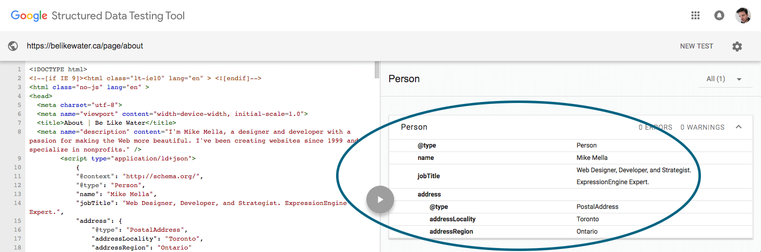
Google
And yes, Google has a Structured Data Testing Tool that lets you check how your content will be understood by their search engine. I've marked up my own About page with Structured Data, and here's how it looks to Google:
Take a look at how your content appears on social networks and in search results. If you'd like to improve that, you probably can.
Have I made you consider a viewpoint you hadn't before? Or do you and I think alike? Either way, maybe we should work together?

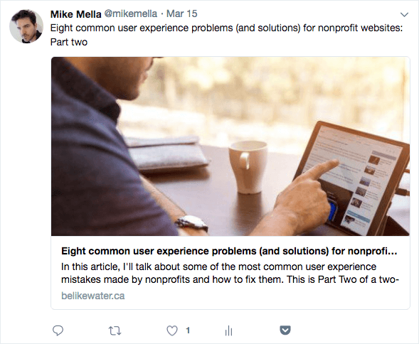
This is Part Two of my two-part article on UX problems and solutions. If you haven't done so, I encourage you to read part one as well!
Now off we go with some more things your nonprofit may need to address...
PDFs are very convenient. In the nonprofit world, workflow often involves creating a document in MS Word before adding to it your website, and word processors allow you to export a document to PDF. So rather than actually creating a webpage about that content, it’s tempting to just upload the PDF itself, link to it, and call it a day. This is a mistake! There a several reasons to avoid delivering your website content as a PDF:
The general rule for PDFs is to use them only when:
Truthfully, there are ways around both of those conditions, but sometimes resources or technologies prohibit them. Try to limit your PDF use to only those situations, and in all other cases, create a responsive, webpage-version of the document. Your audience will thank you.

Have you ever started to read an article on a nonprofit website only to be interrupted by a huge ad that suddenly appears overtop of the content, begging you to sign up for something? That’s a popup - or “popover”. If they annoy you, you’re not alone.
And American study showed that 70% of people say they get annoyed by irrelevant pop-up ads. The reason is obvious: popups interrupt the visitor from consuming your content. This kind of poor user experience can negatively affect the public’s perception of your brand.
People who think that popups are useful often claim that "they work.” They’ll tell you that, for example, presenting your newsletter subscription form inside a popup will generate lots of subscribers. But don't forget: Your goal is not to collect email addresses. Your goal is to recruit subscribers who will actually read your newsletter. According to unbounce.com, people who subscribe via pop-ups aren’t as engaged as those who subscribe from a form on your website or landing page. If you dispute this, perform some testing on your site to see if your popup is working for you.
If you insist on including an element that suddenly appears on the page and draws the eye, try building one that doesn’t obscure the main content, like the sliding subscribe form I designed for HealthBridge.
For some reason, nonprofits love FAQ pages. You probably don't need one though, and here's why:
FAQ pages are often nothing more than a dumping ground for important content that wasn’t given the proper consideration during the information architecture design phase (the phase when you determine what goes where on your website). In this case, important things are overlooked when determining how to present website content, and are therefore banished to the FAQ section in lieu of being given more thoughtful consideration.
If a question is truly frequently asked by many of your visitors, then the answer needs to be more prominent in your website’s design. If your visitors tend to contact you asking “where can I learn how to do [feature X]?” then consider making Feature X a primary menu option, or making it a more otherwise noticeable feature.
Ironically, questions that appear in Frequently Asked Questions are rarely frequently asked. Instead, they tend to be leading questions that are essentially a reason to talk about lofty mission statements, such as “How does [your nonprofit]’s work contribute to my community?”
Read through your FAQs and ask yourself, “Are my visitors really asking this?"
Hover menus, often called “dropdown menus,” are navigation menu links that show a sub-menu when you hover over them. Nonprofits often assume that every page on a website should be reachable in no more than three clicks in order to make the visitor happy. Hover menus are therefore added as a shortcut to reach deep content.
Hover links cause users to skip over main section pages, undermining their importance and neglecting content on those pages. Moreover, on touch devices like smartphones and tablets, there’s no such thing as hover. Touching the top-most link either triggers the dropdown menu, or leads to a page, but not both. So using a hover menu makes it impossible to reach the top-level pages of sections that contain sub-menus.
Hover menus also respond faster than people click, and so are sometimes triggered accidentally. The expanded hover menu almost always obscures other content on the page, so any visitor trying to access that obscured content can have a very frustrating experience indeed.
The three-click rule is simply not true. Usability tests show that people don’t quit after 3 clicks, and don’t feel frustrated if they have to click more. It's not limited clicks but clear link labels that make users comfortable. So as long as your navigation menu is intuitively labeled, and the paths to deeper pages are logical, you needn't worry about minimizing clicks.
Every link in your navigation menu should be clickable and should take the visitor somewhere, including the one that triggers the hover menu. This is your main section page - or section landing page - and it's an opportunity for you to present introductions to deeper content in that section with whatever visual hierarchy you choose, and to offer another page for Google to index. Don’t overlook that opportunity!
Captchas are those “prove you're human” fields in contact forms. They require users to type a word or tick a box in order to submit the form.

The problem with Captchas is evident in their purpose: to help prevent your nonprofit from getting spambot submissions. Why make that the responsibility of your visitors? Completing a form - whether it be to subscribe to a newsletter, or to volunteer, or to donate - is one of the clearest types of goal conversion. Don't get in your visitor's way at that crucial moment by challenging her to prove that she's worth your attention. It doesn't matter how easy it is for your visitors to pass your Captcha test; they shouldn't have to.
There are several alternatives to standard Captcha fields. My personal favourite is the "honeypot Captcha,” which adds a hidden field in your form that only spambots will fill out. Only submissions where that field is empty (and thus, composed by a human who didn't see the hidden field) would actually get sent to you. Don't make the visitor prove he's human. Make the spammer prove he's not.
Read more of my thoughts on the problem with Captcha.
This concludes my two-part article on UX problems and solutions, so how does your website hold up? Are you making some of these mistakes? Get in touch with me and I'll help you resolve them.
Have I made you consider a viewpoint you hadn't before? Or do you and I think alike? Either way, maybe we should work together?

This is one of my biggest pet peeves and something I still encounter it frequently. The problem can be defined as labelling link text inappropriately. The best worst example of this is the phrase "click here,” as in "to read our 2017 annual report, click here” where are the words "click here" are a link to the report.
I have written about the click here problem before. It's a remnant from back when the Internet was new and people didn't know how to interact with links, so we had to actually explain what to do with them. Unfortunately, this led to all kinds of usability challenges, one of the most problematic being that search engines can't understand what's behind a click here link, and therefore wouldn't be able to index that page accurately.
But bad link text extends beyond click here. Any reference to the mechanics of interacting with the webpage or the location of elements on the page is problematic. Content authors often write things like, "sign up for our newsletter in the right-hand sidebar.” Are you sure your signup form is always on the right-hand side? What if I'm using a smartphone? What if I'm blind?
The best way to label link text is to follow these guidelines from the W3C:
When calling the user to action, use brief but meaningful link text that:
- provides some information when read out of context
- explains what the link offers
- doesn’t talk about mechanics
- is not a verb phrase
For more on the click here problem, see my other article about why you shouldn't say "click here".
Carousels (or sliders, or rotating image galleries) are the rotating images that appear at the top of a homepage promoting the latest and greatest site content. When they first appeared, carousels provided a way for different nonprofit stakeholders to all have their content showcased right there on the homepage. Carousels make everyone happy… Everyone except your visitors, that is.
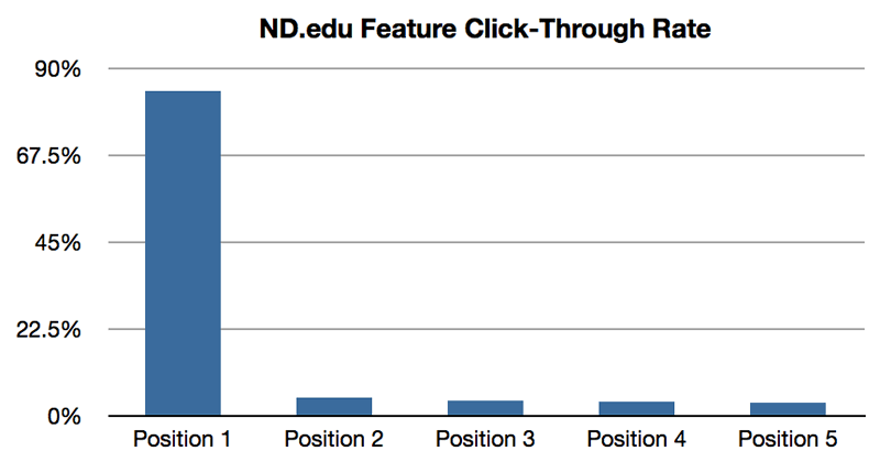
There have been myriad studies done on the effectiveness of carousels as a marketing tool, and what they've determined is that carousels don't work. One study concluded that 1% of visitors actually clicked a slide in a carousel. Of those clicks, 89% were the first slide.
Another problem with carousels is that they are nearly impossible to build with accessibility in mind. They're very difficult to use on smartphones and on assistive devices used by disable visitors.
The truth is, many nonprofits overestimate the importance of their homepage, so whatever appears at the top of your homepage, having it there is probably not as lucrative as you think.
If you still like the idea of an attention-grabbing image, instead of the carousel, try one hero image. Along with improved usability, an added benefit to a hero image is that it forces your organization to make decisions about what content is most important to promote there, rather than stuffing everything under consideration into one spot.
(Pro tip: If your CEO asks where the carousel went, tell him it's still there, but now it only has one slide!)
When The Web was young, splash pages were everywhere. When you visited the website, you would see what is effectively an ad for the website itself before you entered the website. The splash page usually consisted of the nonprofit's name along with an image and possibly a mission statement, and then an Enter button. Fortunately I don't see that too often these days.
What I do sometimes encounter even now are decision prompts presented in the form of splash pages. These can be language-selection prompts for multilingual sites; or “front door” pages that ask you to choose the public site or the members site.
If I've already typed in your website address, you can reasonably assume that I want to visit your website, so don't get in my way by forcing me to make a decision before I even get there. Imagine approaching a clothing store and being stopped by an employee outside the front door and asked “Are you looking for menswear or ladieswear?” Sure it might be helpful, but it's offputting to be required to make such a decision at that point in the experience. And we’re all able to locate the correct department just fine once we we're inside.
Your website should function in much the same way: If there are decisions that your visitor needs to make with regard to interacting with your website, make those options clear on the inside of the site, and until the visitor makes a decision, default to the option that's relevant to most of your audience and your business objectives. If your public site is the one that most people tend to visit, send them there first, with a link to the members site clearly visible. If most of your audience speaks English, default to the English site, and include a clearly visible link to the French site.
And don't forget that you can always create section-specific URLs that send the visitor directly to one area or another so they don’t have to make the decision. For example when I'm promoting this post, I will link to belikewater.ca/blog/entry/ux-problems-part-1 rather than just belikewater.ca.
You can also set a cookie that remembers the visitor's selections when someone uses your site, so that you can deliver the same options automatically the next time she visits.
So there you have my first few tips for improving your nonprofit website's user experience design. This is the end of Part One, but come back next week for more UX tips in Part Two!
Have I made you consider a viewpoint you hadn't before? Or do you and I think alike? Either way, maybe we should work together?
You’re probably well aware of the effect that social media platforms like Facebook, Twitter, LinkedIn, Instagram, Pinterest, Google Plus and others can have on your nonprofit, so you probably have accounts on many of them. Smart decision. But are you using social media to enhance your Web presence, or are you just spreading yourself thin?
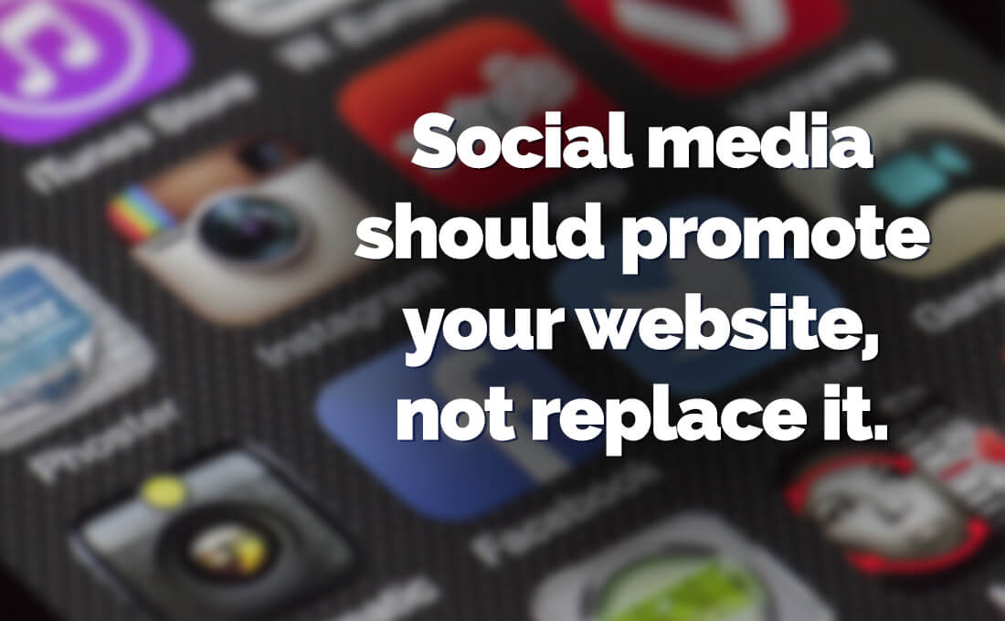
Social media platforms provide features that can really help your organization: Facebook lets you organize an event. Twitter lets you tap into a popular hashtag. LinkedIn lets you connect with other businesses. You can certainly leverage those features to meet your Nonprofit's objectives, but social networks should be considered satellite sites. Thinking of them as multiple versions of your primary website can make content management unruly. If you're experiencing this problem, the solution is to continually remind to your audience where your nonprofit really lives on line: your website. That's where your core content should be, and your social media posts should reference it, not replace it.
Social networks also allow you to embed parts of your social media profiles into your website. You can include your Twitter feed or Facebook posts right there on your homepage if you want. Sometimes, however, nonprofits pepper their main website with embeddable social media feeds as if that is their website content. Avoid this mistake - don’t let your website turn into a dumping ground for social media widgets.
Having a vibrant Facebook community is important, but at the end of the day, your Facebook page is not much different from the next nonprofit's. Your website, on the other hand, is the one online property that gives you 100% control. You don't have to make any compromises in terms of brand identity, content, or character limit. Use your social media content to drive people back to your website, which is where you should deliver your full message.
Promoting your latest campaign? Instead of duplicating your campaign content on your social media profiles, post an introduction about it along with a link back to the full campaign on your website. There, you can include vibrant imagery, calls-to-action that align with your goals, and copy that's been planned by a professional content planner.
If you need a strategy for reining in all your social media profiles so that they're promoting your website instead of cannibalizing it, get in touch with me. I can help.
Have I made you consider a viewpoint you hadn't before? Or do you and I think alike? Either way, maybe we should work together?
Have you ever tested how user-friendly your nonprofit website is? If you have, it was probably back when your site was built (or maybe not even then?).
Did you know that performing regular usability testing can continue to help your nonprofit website long after the launch? In this Droplet article, I'll show you how to do usability testing, and why you should.
Usability testing is the practice of recruiting a few people to test how usable your website is, though it can also be used to test Web apps or any other product that people interact with. It is sometimes referred to as "user testing," though I prefer to avoid that term as it implies that the user is being tested rather than the website, and so can make some people reluctant to participate.
To start usability testing, you need to find some users to take part. People often make the assumption that the more users you have to test the website the better, however, it turns out that three people is the magic number. In his book, Don't Make Me Think, Steve Krug points out that "the first three users are very likely to encounter many of the most significant problems related to the tasks you’re testing."
Unless they're volunteering, it's customary to pay each user a small honorarium of $50 to $100 for their time, and they should be from your target audience and not connected to your organization. As much as they may want to help, avoid recruiting staff and board members.
Once you have your users, you need to establish some tasks that you want them to perform. These should align with your nonprofit's goals for your website: the things you want your visitors to be able to do there. Some basic examples of these tasks include:
You may learn that most or all of your users run into problems in the same areas. They may have trouble locating the Donate button. Or they may do a lot of scrolling around a page before finally accomplishing a task. This is where their behaviour can also be insightful. If you're able to watch them during the testing, you can catch any brow furrowing or frustrated sighs, which can tell you a lot about their experience and which you can ask them about later. And don't forget to test your mobile layout as well!
You can also employ usability testing to learn more abstract things about your website. For example, you can ask users to describe the personality of your nonprofit based on your website. Does that align with your mission and how you want the public to perceive your organization?
Testing your website's usability only requires a computer and three people, but there are even easier ways to make it happen. Services like UserTesting.com allow you to recruit people of certain demographics (age range, income, etc.) and collect recorded videos of them using your website. If real-life tests aren't an option, this may be a suitable alternative.
Usability testing is most useful when you're in the design phase of your website, since it allows you to make immediate changes to the design based on the results. It can continue to provide valuable information well into the future, however. Your website should always be changing and growing, so you should continue to ensure that it remains optimized for user experience as you add new features and content. And just as Web trends and technologies come and go, the way people interact with websites also changes, so you need to stay ahead of the curve.
Once you have results from usability testing, it's time to evaluate how they impact your website and what changes you may need to make. If you need assistance with this or just setting up usability testing, I'm here to help. Get in touch!
Have I made you consider a viewpoint you hadn't before? Or do you and I think alike? Either way, maybe we should work together?
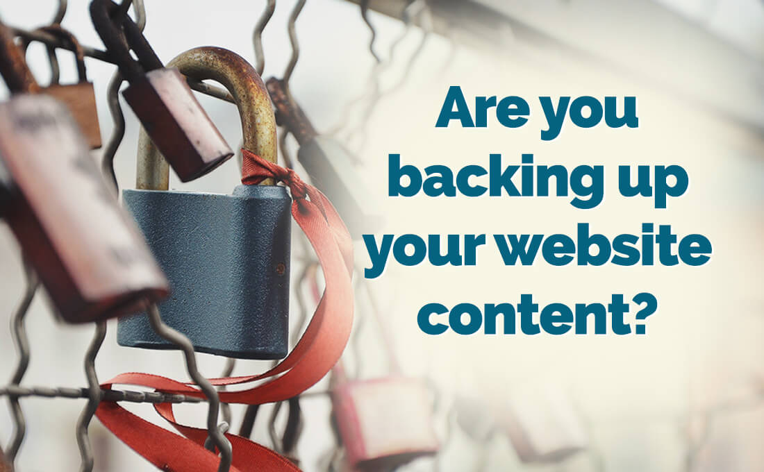
Do you have a backup solution in place for your nonprofit website? If your website suddenly disappears, would you have a copy of all your content? There are many reasons this could happen, and if it does, you need to have a strategy for handling it. The first part of that strategy is having a system in place that creates backups of all your website data on a regular basis.
In mid 2017, Ransom where attacks were all over the media. Huge multinational companies were having their websites "hacked" and held for ransom: Pay us and we'll give you your content back. This kind of attack is not necessarily perpetrated by a person actively targeting an organization. It could be a "bot" that is attacking websites at random.
A much more likely scenario is that your site is infected with malware. Typically, this is what actually happens when people claim they've been "hacked." Again, rather than a real person targeting you, it's more like a person created a program that finds vulnerabilities in websites, infects them, then does something nasty to them. It may take the whole site offline; or it may replace your webpages with an ad or an offensive message; or it may corrupt all your data!
Your website is stored on a server - a computer owned by your website host. Many nonprofits subscribe to a "shared hosting" package. That means that yours is not the only website on the server. You're sharing that space with 20 or more other websites owned by the host company's other customers.
Normally this isn't an issue, but when one of those other sites is compromised, it can affect your site as well. One of my clients had their website taken offline twice because someone else's website was infected by a malware attack, and both sites happened to share the same server. This is especially common with websites powered by WordPress - Yes, I'm afraid the most popular CMS in the world is also the most vulnerable.
None of these scenarios are good. Solving the problem depends on the particulars of what happened, but in any case, having all your website content backed up somewhere will help to put your mind at ease, especially if you have data from members, customers, or donors.
Some Web hosts offer regular backups with their hosting plans. Be careful though - there is often fine print in hosting agreements stating that in the event of a data loss, the host is not obligated to provide you with backups. Ask your Web host to be sure.
Depending on the CMS you're using, there may be a plugin or add-on available that allows you to back up your data. Be sure to get one that offers backups of both your files and your database, and automated backup scheduling so you don't have to worry about it. You'll also want to be mindful of where they're being stored and how many backup copies are saved. You don't want to hit your Web space limit due to having too many backup files.
Another option is to subscribe to a third-party backup service like CodeGuard. These services offer a monthly or yearly fee and provide lots of secure options for backing up your content, often off-site so the backups don't count against your Web storage.
There are things you can do to protect yourself from getting into this situation in the first place. For one, you'll be in a much safer position if you have a secure content management system. Whichever CMS you use, be sure to set it up so that any vulnerabilities are protected in accordance with best practices. And don't forget to secure your site with SSL.
You should also be monitoring activity on your site to make sure there aren't any spam member accounts being created; once a spammer has the ability to log into your site, he can do a lot of damage.
If your content is worth promoting to your audience, it's worth backing up regularly. Don't wait until you have an emergency to put your backup solution in place. And if you need help setting any of this up, get in touch!
Have I made you consider a viewpoint you hadn't before? Or do you and I think alike? Either way, maybe we should work together?
![How does your garden [website] grow? | Simplify Google Analytics](/images/made/images/uploads/blog/tomatoes_1100_680_s_c1_c_c_0_0_1.jpg)
Photo Credit: Lucy Maudsley Flickr via Compfight cc
Gardener: "I planted tomatoes this year!"
Friend: "Oh yeah? How are they growing?"
Gardener: "I have no idea. I never look at my garden."
Silly, right? But are you making the same mistake with visitor tracking on your website?
So you have Google Analytics installed to track what your visitors do on your website, and you've set up some goals that align with your nonprofit's objectives. Great! But do you actually monitor those statistics? The point of tracking visitor behaviour is so that you can learn which components of your website are helping your nonprofit and which parts need work.
Google Analytics reports help you to streamline your website to meet your audience’s needs and your organization’s objectives, but those reports can only help you if you actually look at them. Unfortunately, Google Analytics intimidates a lot of people, but fortunately, I have some tips on how to make monitoring your visitor statistics much more pleasant.
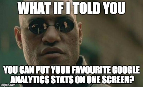
Having felt intimidated by Google Analytics myself, I created my own Dashboard. A Dashboard is a view of your visitor stats that shows exactly the information you want to know about your visitors, all on one screen, so that you don’t have to drill down into the complicated maze that is Google Analytics.
For a limited time I'm offering my Be Like Water Stay Current dashboard for free to everyone who subscribes to my Droplets newsletter. Once you install my dashboard in your Google Analytics account, you'll see the following information about your website, all on one screen:
The next step to simplifying Google Analytics is to make it email you those reports on a regular basis. You can receive an email with this week’s stats compared to last week's (or monthly comparisons, or whatever) containing only the information you want - in plain English - all in one document.
Once you’re armed with that information, you can make decisions about which content is resonating with your audience and needs nurturing; and which content is not converting and needs improvement.
Get in touch with me to create a custom Google Analytics Dashboard for your nonprofit and have it delivered to your inbox weekly (or daily, or monthly...) so you can start to leverage visitor tracking to help your organization.
Have I made you consider a viewpoint you hadn't before? Or do you and I think alike? Either way, maybe we should work together?
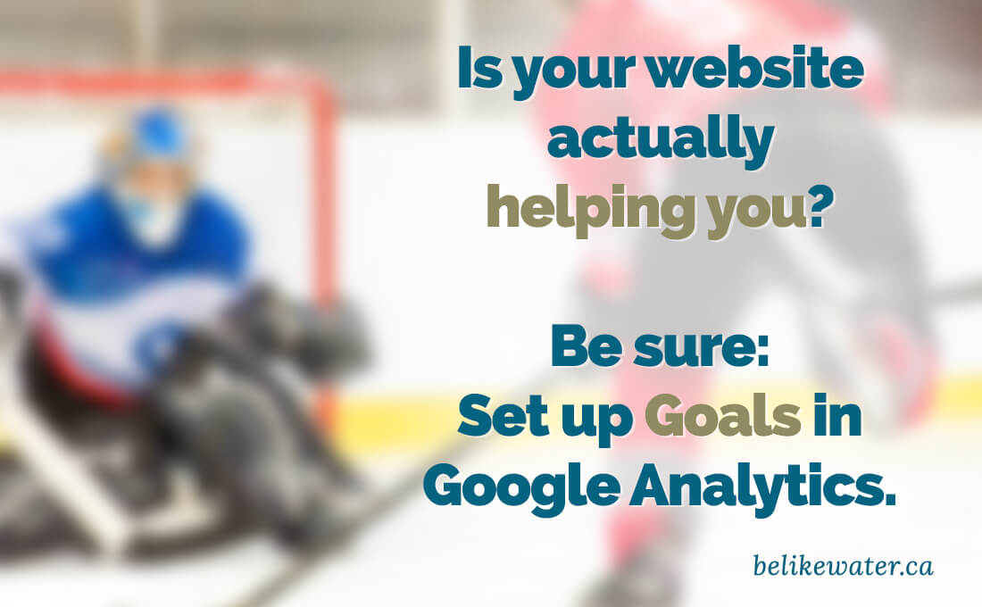
Are you sure your website is actually helping your organization? How do you know? Sure, you can probably find out how many people are visiting your website, but bringing people to your website is not your website's job.
What are the objectives that you want visitors to accomplish through your site? Do you want visitors to:
Those are all things that your website should be doing for your nonprofit. As far as Google Analytics is concerned, all of these are "goals," and in order to know whether people are accomplishing them, you should be tracking them. Google Analytics Goals can show you if your website is helping you to achieve your organization's objectives.
You can set up goals in Google Analytics by going to the Admin section of your Analytics account. On the right-hand side, you should see Goals. There, you can set up all kinds of behaviours, such as these:
You can even get really granular and track which newsletter subscribers arrived at your site through your social media campaign, for example.
The goals you set up in Analytics depend on your organization’s objectives, so they'll be different for every nonprofit. If you need help setting up goals, get in touch with me. I can help you determine what your goals should be, and then help you set them up.
Have I made you consider a viewpoint you hadn't before? Or do you and I think alike? Either way, maybe we should work together?
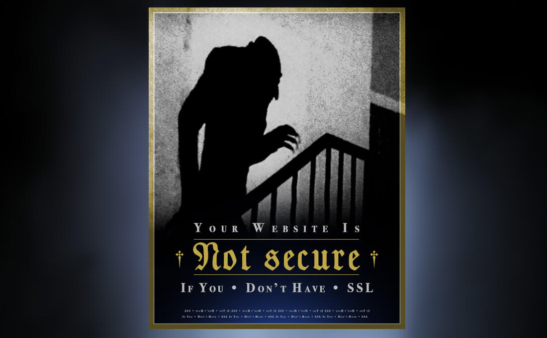
An SSL certificate ("Secure Sockets Layer”) is something you add to your website that makes it more secure. Every time a visitor does something on your website - logs in, makes a donation, buys an item - information is passed from the visitor’s machine to your website’s server. That information could be login credentials or even credit card information. Sometimes hackers and bots try to intercept that information, but if your site is secured with SSL, then that information is protected.
When your site is running an SSL certificate, you’ll see a padlock icon in the address bar to the left of your URL, and your website address will begin with https instead of http.
Aside from the obvious benefit of protecting your visitors and your website from the Nosferatu nefarious, there’s one great reason to make the change to SSL: Google wants you to. Google has announced that starting in October 2017, it will give a page rank boost to sites that are secured with SSL over ones that are not:
We called for “HTTPS everywhere” on the web...We're starting to use HTTPS as a ranking signal. For now it's only a very lightweight signal...But over time, we may decide to strengthen it, because we’d like to encourage all website owners to switch from HTTP to HTTPS to keep everyone safe on the web.
So if you’re at all concerned with Search Engine Optimization and how your website ranks in Google searches (and you should be!) SSL is the way to go. In fact, Google now flags sites without SSL as “not secure.”
To get secured with SSL, there are a few steps you need to take:
First, you need to get a Certificate Signing Request (CSR) from your website host. Your Web developer may be able to do this, or you may need to contact your host.
Your website will also need a dedicated IP address, which many don't have, but they can be purchased for about $5/month. Once you authorize it, your Web host will set that up. When that's done, your server is saying “Okay, I’m ready for the SSL certificate!”
Next, you need to buy an SSL certificate. These are like website domains in that you “rent” them for a period of time before you have to renew them. You can get one from your host or from a third-party provider. Prices vary from free to hundreds of dollars depending on your needs, but most organizations would only need to pay about $20/year for one.
At this point it's time to install the SSL certificate, and then update the code in your website to make all links point to https pages instead of http.
Sound confusing? If you need assistance with this or any other aspect of SSL, I'm available for hire. Get in touch with me - I'm happy to help.
Now’s the time to make the switch to a secure website and stop living in fear!
Have I made you consider a viewpoint you hadn't before? Or do you and I think alike? Either way, maybe we should work together?

Does your nonprofit website have a contact form of any kind? Most do. You may have a form to allow visitors to get in touch with you from your Contact page. Or a comments section on your blog. Or a form allowing visitors to sign up for your newsletter.
Are you using any kind of Captcha verification on your forms? Captcha is that test that checks if the submitter is “human.” They may have to decipher a word on a busy background. Or select all the images with cats in them. Or maybe just tick a checkbox. Whatever method you’re using to make your visitors prove they're human, stop it.
Captcha serves one purpose: to prevent spam on the website that has the form. The problem is, Captcha puts that responsibility on the website visitor, not the website owner. It’s not your visitor’s job to manage spam on your website. That’s your deal.
The bigger issue is that by using an “are you human” test, you’re interrupting your visitor mid-conversion. You’ve put plenty of effort into streamlining your nonprofit website’s content to attract visitors. Once they get there, you want them to engage with you in some way. Few actions are more engaging than a visitor actually reaching out and trying to connect with your nonprofit directly. Why get in their way at that crucial point? Using Captcha is like telling your visitors, “You want to engage with us? Prove you’re worth it.” Is that the first impression you want to make?
If you’re really concerned about spam, there are alternatives to making your visitors complete a test.
If you’re trying to protect a comments section from spambots, you could use a service like Disqus, which requires that they log in with a social media account. Spam bots are unable to do that (so far).
If your audience is on Facebook, you could use Facebook’s embedded comment form, which will ask them to log into their Facebook account first. Of course these still require the user to do something before doing what they came to do, but perhaps less confrontationally.
If you’re protecting a contact form, there’s a technique called “honey pot Captcha,” which adds a hidden field in your form that only spambots will fill out. Only submissions where that field is empty (and thus, composed by a human who didn't see the hidden field) would actually get sent to you.
When your audience is trying to connect with your nonprofit, there are plenty of distractions online that can get in their way. Don't get in your own way as well.
Have I made you consider a viewpoint you hadn't before? Or do you and I think alike? Either way, maybe we should work together?
Nonprofit Website Review is a free monthly multimedia publication in magazine format that provides website design and development information from leading website designers and developers in the nonprofit field. Paul Harvey and John Quinn were kind enough to invite me to be interviewed for the publication. You can watch it here.
Have I made you consider a viewpoint you hadn't before? Or do you and I think alike? Either way, maybe we should work together?
Are you looking for a Web rockstar? Or perhaps an HTML ninja? How about a user experience guru or a digital geek or a social media nerd? Well keep looking.
A part of me dies every time I encounter an RFP or job description that calls for one of these titles. Would you work with a doctor who refers to himself as a "medical ninja"? Or an accountant who claims to be a "investment rockstar"? I doubt it.
If you're an organization looking for help with your Web presence, don't make this mistake. You take your website seriously. Give the same attention to the consultants you work with and you'll find better qualified people.
And if you work in digital media, have respect for your skillset and call yourself what you are. In many ways, our industry is still gaining acceptance, so avoid using nonsensical qualifiers when describing yourself.
Have I made you consider a viewpoint you hadn't before? Or do you and I think alike? Either way, maybe we should work together?
Here's a video tutorial on how to use the Content Templates feature in ExpressionEngine's Wygwam add-on.
As a starting point, you can download the JavaScript file, placeholder image, and thumbnail images that I use in the demo.
Have I made you consider a viewpoint you hadn't before? Or do you and I think alike? Either way, maybe we should work together?
I am often asked by clients whether the external links in their websites should open in a new tab (or window) by default, so I'll set the record straight here. All links, regardless of their destinations, should open in the current tab, not in a new one. There are a few reasons why this is good practice:
Links were never meant to open in new tabs by default. In its most basic form, The code to create a link includes no indication of what tab to open it in, so it opens in the current one, replacing the page where you found the link. To make it open in a new tab, more code - a target attribute - needs to be added: target="_blank"
Every browser has a Back button that lets you return to the previous page. Forcing links to open a new tab is known as "breaking the Back button." The problem is that some people may not realize that a new tab has opened, and when they try to click the back-button to get to the previous page, it won't work.
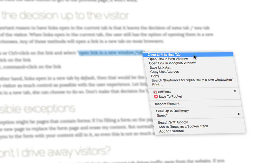
The most important reason to have links open in the current tab is that it leaves the decision of same tab / new tab in the hands of the visitor. When links open in the current tab, the user still has the option of opening them in a new tab if she so chooses. Any of these methods will open a link in a new tab on most browsers:
If, on the other hand, links open in a new tab by default, then that would be the only option. It's always good practice to give the visitor as much control as possible with the user experience. Let links open naturally. If the user wants to open them in a new tab, she can choose to do so. Don't make that decision for her.
One exception might be pages that contain forms: If I'm filling a form on the page, and then I click a link, I don't want the new page to replace the form page and erase my content. But normally, clicking the Back button will return you to the form with your content still in it, so even this is not so much a concern.
I sometimes hear the argument that opening links in the current tab drives traffic away from the website. If you believe that, then why include external links in the first place? Furthermore, a visitor could just as easily get distracted by something in a new tab and still decide to abandon your site. Besides, if you're concerned that visitors will lose interest in your content just because they clicked a link, perhaps you need to work on your content!
Have I made you consider a viewpoint you hadn't before? Or do you and I think alike? Either way, maybe we should work together?
Photo Credit: Raphael Goetter via Compfight cc
One of the first steps in performing a content audit is to document all the pages you currently have in your website. This is essential not only for aiding in the process of migrating content to the new version of the site, but also to correct any broken links that may exist. Many organizations don't keep records of site content, but fortunately, there are many online services that will scan your website and list all your broken links, and some also map your website's pages to you can get an overview of your information architecture. Here are some online resources that can help with this:
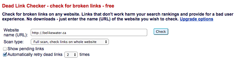
DeadLinkChecker.com is a simple tool that scans your site and tells you which links don't work, and where on your site you can find them. This site does not offer sitemapping functionality:
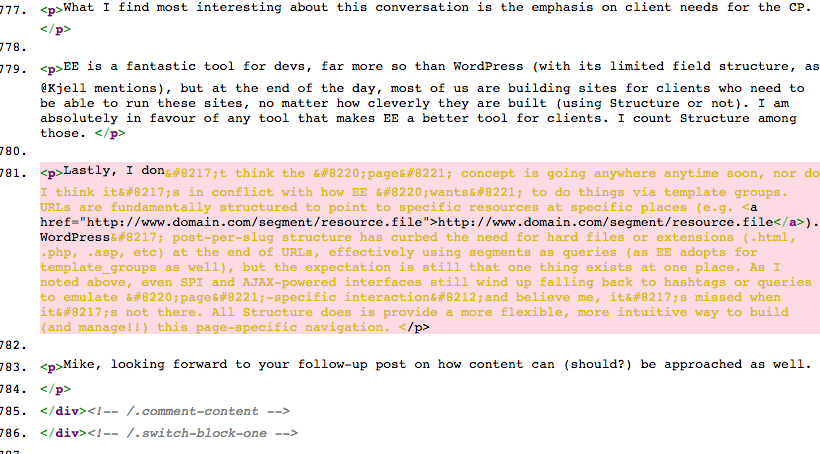
brokenlinkcheck.com is even better, as it not only shows you what pages on your site have broken links, but it also provides links straight to your page's code with the broken link highlighted, so your Web developer knows right where to go to correct the error:
XML-Sitemaps.com has a nice crawler that will generate a sitemap in several formats. You type in your URL, hit Start, and once it's done its thing, it will let you download the results as an XML file or HTML. For the purposes if performing a content audit, the HTML version is most helpful. It displays your site's pages in a tree hierarchy with links to each page:
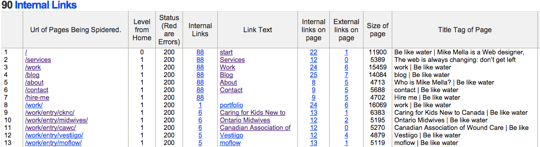
InternetMarketingNinjas.com have a great crawler that will generate a table of your site's pages, along with helpful information like the number of internal and external links on each page, the meta description offered to search engines, and the title tag being used to identify the page:
Learn more about how to conduct a website content audit over at the Nonprofit MarCommunity.
Have I made you consider a viewpoint you hadn't before? Or do you and I think alike? Either way, maybe we should work together?

In my latest post on the Nonprofit MarCommunity, I provide 5 reasons you should stop fighting over your nonprofit’s home page.
Have I made you consider a viewpoint you hadn't before? Or do you and I think alike? Either way, maybe we should work together?

I was recently asked to contribute an article for the Nonprofit MarCommunity, a website for those who work in nonprofit marketing communications. I decided to write about how to brief a web designer or developer for a new project. Check it out.
Have I made you consider a viewpoint you hadn't before? Or do you and I think alike? Either way, maybe we should work together?

The Web changes fast. Every day there are new tools released that can help with your nonprofit’s Web presence. Both the software and hardware used by your audience evolve at an alarming rate, and your website needs to keep up. But how do you know when it’s really time to redesign? How can you tell if you should rebuild, redesign or just refresh your nonprofit website?
In this article I've written for the Nonprofit MarCommunity, I've presented some questions to ask yourself to determine the best approach to giving your website an overhaul.
Have I made you consider a viewpoint you hadn't before? Or do you and I think alike? Either way, maybe we should work together?
Is your website riddled with the phrase “click here”? I’m amazed at how often I still see this phrase used as a link label. Using “click here” to identify links is a very bad idea and I’ll tell you why, but first, some history…
The phrase “click here” is a throwback to the late 1990s when the Web was new and many people really didn’t understand how to use it. They actually had to be told to point their mouse at a link and click on it, otherwise they might not know that there was more content available. But it’s no longer the 1990s - Your visitors know what a link is and how to use it, so it’s time to start promoting your great content and stop patronizing your visitors.
There are all kinds of reasons why you shouldn’t use “click here.” For one, not everyone clicks. People use many devices to browse the Web these days: PDAs, phones, screen readers…not just standard computers. People are tapping, touching, typing…not just clicking.
Search engines also get confused by the phrase. Search engine bots rely on a link’s label to identify that link’s content and match it with people’s search terms.
And of course the phrase “click here” just doesn’t look very good. If it’s not immediately evident to you how silly the phrase “click here” looks, consider this:
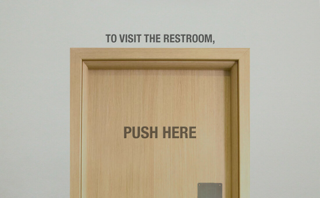
Imagine you’re in a restaurant. You get up to go to the restroom. When you find it, you see a door with a sign that reads “To visit the restroom, push here.” Ridiculous, right? You’re thinking “Don’t tell me how to interact with the door. I know how to do that. Just tell me what’s behind the door and I’ll figure out how to get there.”
The same logic should be applied when labelling links: It’s not your responsibility to explain to your visitors how to interact with links. All you need to do is make sure they can tell what the link is.
The W3C - the people who decide what constitutes standard practices on the Web - have been advising against saying “click here” for years. The W3C’s recommendations on how to phrase link text boil down to four rules of thumb:
When calling the user to action, use brief but meaningful link text that:
- provides some information when read out of context
- explains what the link offers
- doesn’t talk about mechanics
- is not a verb phrase
I find that the simplest way to test whether you’ve labelled your link properly is to ask yourself “If this link were the only phrase on the whole screen, would I still know what the link is about just by reading it?” If the answer is no, reword it. You can see how “click here” fails this test: Your content is probably not about the subject of clicking here, so links to it should not be labelled like that. So instead of this:
To learn more about Be like water, click here.
Say something like this:
Learn more about Be like water.
Considering what I said about search engines above, which of those two links do you think would fare better in results for the search term “Be like water”?
If you’re concerned that your links won’t be identifiable as such, then you need to revisit the formatting of your website copy. Your website copy should essentially be presented in one style, and your links in another (usually underlined and/or a different colour) making them identifiable simply because they look different.
If you’re worried that yours won’t, then you’ve probably tried to make certain blocks of text stand out by peppering your website copy with all kinds of different formatting: bold text, underlines, multi-coloured words, various letter sizes, fonts, and so on. This is another bad idea. When is the last time you read a book that had various formatting styles within a paragraph?
Your body copy should be legible, first and foremost. Sure, you can emphasize certain parts of your content with the odd bold or italicized phrase, but the best way to ensure that your readers notice the important parts of your content is to hire a great copywriter to present your content accordingly.
Your audience is visiting your website to learn about your organization, not to learn about how the Web works. Present your content with that in mind.
Be sure to check out the "click here" episode of the Website 101 Podcast that I recorded with Sean Smith.
Have I made you consider a viewpoint you hadn't before? Or do you and I think alike? Either way, maybe we should work together?